Flexbox, short for Flexible Box Layout, is a powerful tool in modern web development for creating flexible and responsive layouts. It provides a straightforward way to design complex layouts with ease, allowing developers to efficiently distribute space among items within a container, align content, and control the flow of elements.
In this comprehensive cheat sheet, we’ll explore the various properties of Flexbox and how they can be used to create versatile and dynamic layouts.
Understanding Flexbox Basics
The flexible box layout module was designed as a one-dimensional layout model, offering space distribution between items in an interface and powerful alignment capabilities. The one-dimensional layout model also refers to the fact that Flexbox deals with layout in one dimension at a time — either as a row or as a column.
Before diving into the specific properties of Flexbox, it’s essential to understand the fundamental concepts:
Flex Container and Item
Before diving into the specific properties of Flexbox, it’s essential to understand the fundamental concepts:
- Flex Container: The parent element containing one or more flex items.

- Flex Items: The child elements within the flex container that can be laid out using Flexbox properties.

The two axes of Flexbox
When working with Flexbox, you need to work around two axes – the main axis and the cross axis. The main axis, whereas, the cross axis runs perpendicular to it.
Main Axis and Cross Axis
Main Axis: The main axis is defined by the flex-direction property, and has four possible values.
- row
- row-reverse
- column
- column-reverse
You should also know that the flex items are laid out around the main/ primary axis. The primary axis along which flex items are laid out.
Cross Axis:This axis runs perpendicular axis to the main axis.
Now let’s dive into the Flexbox container properties!
Flexbox Container Properties
Display
The display property with a value of flex or inline-flex is used to establish a flex container. It enables a direct context for all its direct children.
- display: flex: Creates a block-level flex container.
- display: inline-flex: Creates an inline-level flex container.
display: flex; /* or inline-flex */
}
Please note that CSS columns do not affect a flex container.
Flex-direction

The flex-direction property specifies the direction of the main axis and determines how flex items are laid out within the flex container.
flex-direction: row | row-reverse | column | column-reverse;
}
- row: Items are laid out in a horizontal row (default).
- row-reverse: Items are laid out in a horizontal row but in reverse order.
It means if you choose row or row-reverse, your main axis will run along the row in the inline direction.
- column: Items are laid out in a vertical column.
- column-reverse: Items are laid out in a vertical column but in reverse order.
And, if you choose column or column-reverse, the main axis will run from the top of the page to the bottom — in the block direction.
Moreover, if your flex-direction is set to row or row-reverse, the crow axis runs down the columns.
If your main axis/ flex-direction is column or column-reverse then the cross-axis runs along the rows.
Flex wrap

The flex-wrap property controls whether flex items are forced onto a single line or allowed to wrap onto multiple lines. By default, all items will try to fit in one line. However, you can change it and let the items wrap as needed with this property.
flex-wrap: nowrap | wrap | wrap-reverse;
}
- nowrap (default): all items will wrap on one line
- wrap: flex items will wrap from top to bottom onto multiple lines.
- wrap-reverse: flex items will wrap from bottom to top on multiple lines.
flex-flow
The flex-flow property is a shorthand for specifying both flex-direction and flex-wrap properties in one declaration.
flex-flow: column wrap;
}
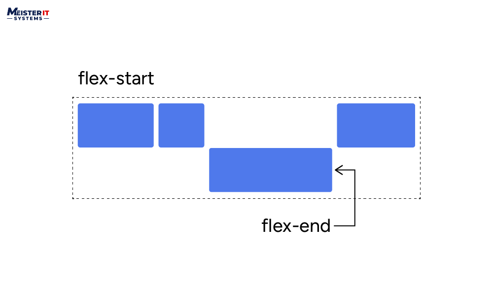
justify content
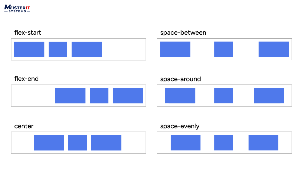
The justify-content property aligns flex items along the flex container’s main axis. It allocates any additional free space when all flex items in a row are either inflexible or have reached their maximum allowable size. This property also helps manage the alignment of items when they exceed the row’s capacity.
justify-content: flex-start | flex-end | center | space-between | space-around | space-evenly | start | end | left | right … + safe | unsafe;
}
- flex-start (default): items are placed toward the beginning of the flex-direction.
- flex-end: position items toward the end of the flex-direction.
- start: items are positioned toward the start of the writing-mode direction.
- end: Align items toward the end of the writing-mode direction.
- Left: Align items toward the left edge of the container, unless the flex-direction doesn’t make any sense, then it behaves like the start.
- right: position items toward the right edge of the container, unless the flex-direction doesn’t any sense, and then it behaves like end.
- center: Align items centrally along the flex line.
- space-between: Distribute items evenly along the flex line, with the first item at the start line and the last item on the end line.
- space-around: Distribute items evenly with equal space around them, resulting in non-uniform gaps as all the items have equal space on both sides. The first item has one unit of space from the edge, while subsequent spaces between items are double since each item has its own spacing.
- space-evenly: Distributes items with equal spacing between them and between the items and the container edges, ensuring uniform visual gaps.
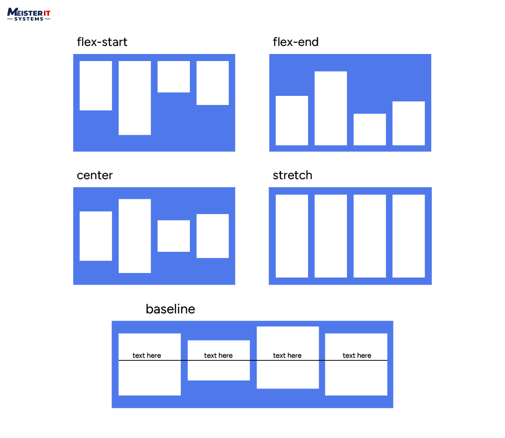
align items
The align-items property aligns flex items along the cross-axis of the flex container. You can think of it as the justify-content version for the cross-axis (perpendicular to the main-axis).
align-items: stretch | flex-start | flex-end | center | baseline | first baseline | last baseline | start | end | self-start | self-end + … safe | unsafe;
}
- stretch (default): Items stretch to fill the container’s cross-axis, while still adhering to minimum and maximum width constraints.
- lex-start / start / self-start: items are placed at the start of the cross-axis. The only difference is whether alignment follows the flex-direction or writing-mode rules.
- flex-end / end / self-end: Aligns items at the end of the cross-axis. The only difference is whether alignment follows flex-direction rules vs. writing-mode rules.
- center:items are centered in the cross-axis
- baseline:Align items along the baseline.
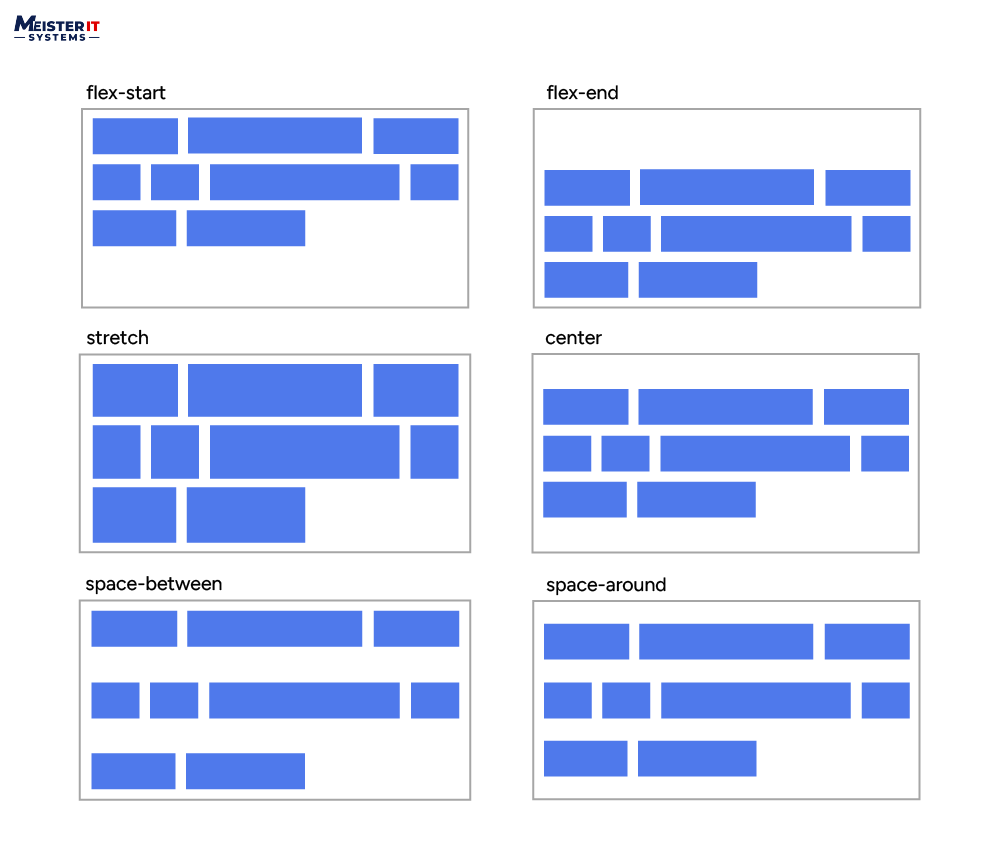
align content
The align-content property aligns flex lines within the flex container if there is extra space in the cross-axis. It’s similar to how justify-content aligns items within the main axis.
align-content: flex-start | flex-end | center | space-between | space-around | space-evenly | stretch | start | end | baseline | first baseline | last baseline + … safe | unsafe;
}
- Normal (default) Arrange items in their default positions, as if no specific alignment value was set.
- Flex-start / Start: Aligns items at the beginning of the container. Flex-start respects the flex-direction setting, while Start follows the writing-mode direction.
- Flex-end / End: Items are aligned at the end of the container. The flex-direction influences flex-end, whereas the End aligns with the writing mode.
- center:Positions items in the center of the container.
- Space-between:Items are evenly spaced, with the first item at the beginning and the last item at the end of the container.
- Space-around:Items are evenly spaced, with equal space around each item.
- Space-evenly:Items are distributed evenly, with consistent spacing around them.
- Stretch:Stretches the lines to fill the available space.
Note: You can apply the safe and unsafe modifier keywords to any of these alignment settings. However, browser support may vary. They are used to avoid alignment issues that might lead to inaccessible content.
Flex Item Properties For The Children
order
By default, flex items are aligned in the source order. The order property specifies the order in which flex items appear within the flex container.
order: 5; /* default is 0 */
}
Items with the same order revert to source order.
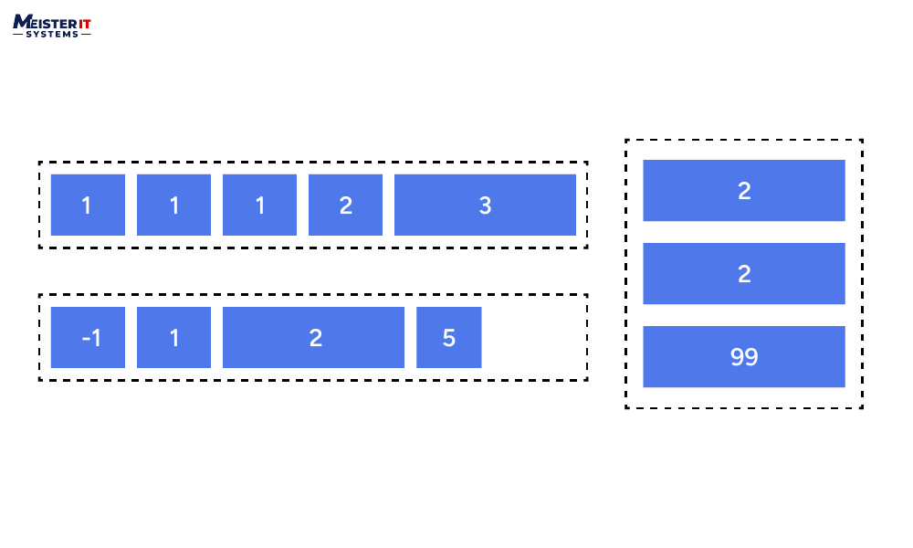
flex grow
The flex-grow property specifies how flex items should grow relative to each other to fill the available space along the main axis.
For an instance, if every item in the container has a flex-grow value of 1, the extra space will be shared equally among all the children. However, if one of the children has a flex-grow value of 2, it will receive twice as much of the additional space as each of the other items (or at least it will attempt to do so).
flex-grow: 4; /* default 0 */
}
Please note negative numbers are not valid.
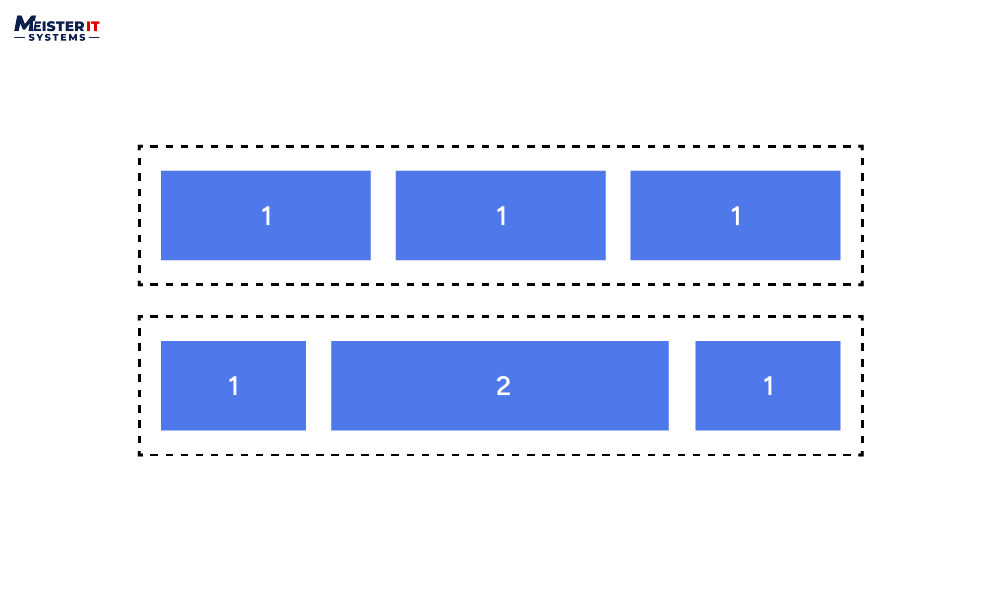
flex shrink
The flex-shrink property specifies how flex items should shrink relative to each other when there’s not enough space along the main axis.
flex-shrink: 3; /* default 1 */
}
Please note negative numbers are not valid.
flex basis
The flex-basis property specifies the initial size of a flex item before any remaining space is distributed.
flex-basis: | auto; /* default auto */
}
flex
The flex property is a shorthand for specifying flex-grow, flex-shrink, and flex-basis properties in one declaration.
flex: none | [ <'flex-grow'> <'flex-shrink'>? || <'flex-basis'> ]
}
The default flex setting is 0 1 auto. However, if you set flex using a single numeric value, such as flex: 5;, this changes the flex-basis to 0%, making it equivalent to flex-grow: 5; flex-shrink: 1; flex-basis: 0%;.
align self
The align-self property aligns a single flex item along the cross axis, overriding the align-items property of the flex container.
align-self: auto | flex-start | flex-end | center | baseline | stretch;
}
Conclusion
Flexbox provides a flexible and intuitive way to create dynamic layouts in web development. By mastering these Flexbox properties, developers can efficiently design responsive and adaptive interfaces for a wide range of applications. This comprehensive cheat sheet serves as a valuable reference for both beginners and experienced developers looking to harness the full potential of Flexbox in their projects.
Want to know more about Flexbox properties, stay tuned to the MeisterIT Systems blog!
Also, if we have missed any Flexbox property in the blog, do let us know in the comments!